The Share: Economic Analysis
"In simple hope our ancestors were born across the sea,
envisioning a future that improves for you and me.
As they died to raise us higher, let us live to see us free,
— For Justice Marches On!"
Lyrics by Vector Hasting, from Lyrics to The Battle Hymn for Fair And Share.
Performances by Suno AI
Links for The Share
Overview
The main analysis is as follows:
1) What is the Tax Rate to support the initial Share Amount of $20,000?
2) For how many Americans is this system better?
3) Showing the growth of the Share Amount over time as compared with All Income and GDP.
4) What economic analysis has been done for this policy.
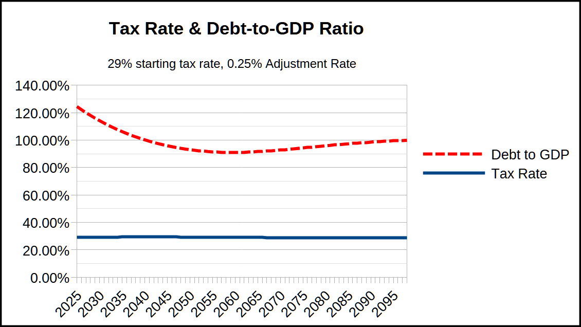
1) What is the Tax Rate? What happens to the Debt?
This spreadsheet contains the essential calculations to model the Tax Rate and the Adjustment Rate .
The result is a Tax Rate of 29% with an Adjustment Rate of 0.25%.
Figure 1. Tax and Debt Rates with The Share
Note that the tax rate fluctuation is under 1% (ie, the rate never goes over 29.4% and never goes under 28.6%) while driving the debt to the Target Debt Ratio of 100% over 30 years.
2) How many are better off?
This spreadsheet contains the methodology for comparing the old tax rates to the new tax rate.
The result is that the point of crossover for taxpayers from being better off verses worse off is $176,100 per year. This is because that is the point under current law that taxpayers no longer pay social security and medicare taxes. Under the Share, all taxpayers pay the same rate for All Income no matter their income level.
This income level of $176,100 is at the 80% level of US incomes.
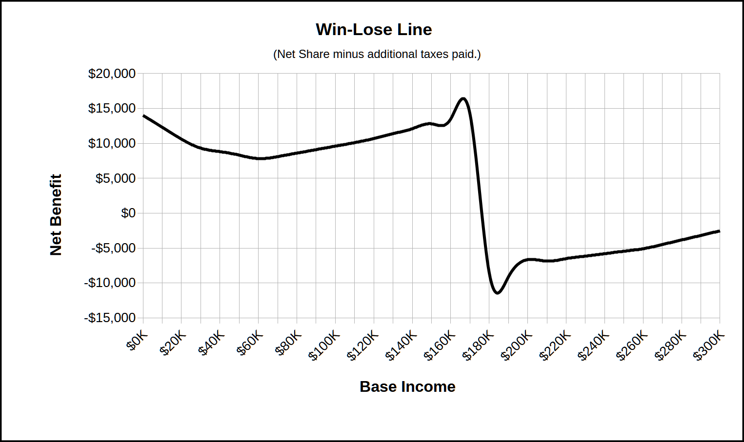
Figure 2. Win-Lose Line for The Share
Note that under this analysis, the total amount of additional tax paid is never greater than approx $17,000. However, this is probably not accurate in practice, because this analysis only considers wage-earners who fall under the Income and Payroll Taxes. Americans who exploit the categorization of their income as capital gains, or dividends, or other favorable tax brackets capped at rates lower than the Income Tax rates will fare correspondingly worse under The Share.
3) Share over time compared with All Income and GDP
The Share is by design a fixed percentage of All Income, which is itself intrinsically a percentage of GDP. Though that percentage can vary, it is steadily 77.67% of GDP from 1975 to 2024. [1]
Based on these assumptions, we have this graph of the rise of the the Share Amount as compared with All Incomes and with GDP over the next 74 years.
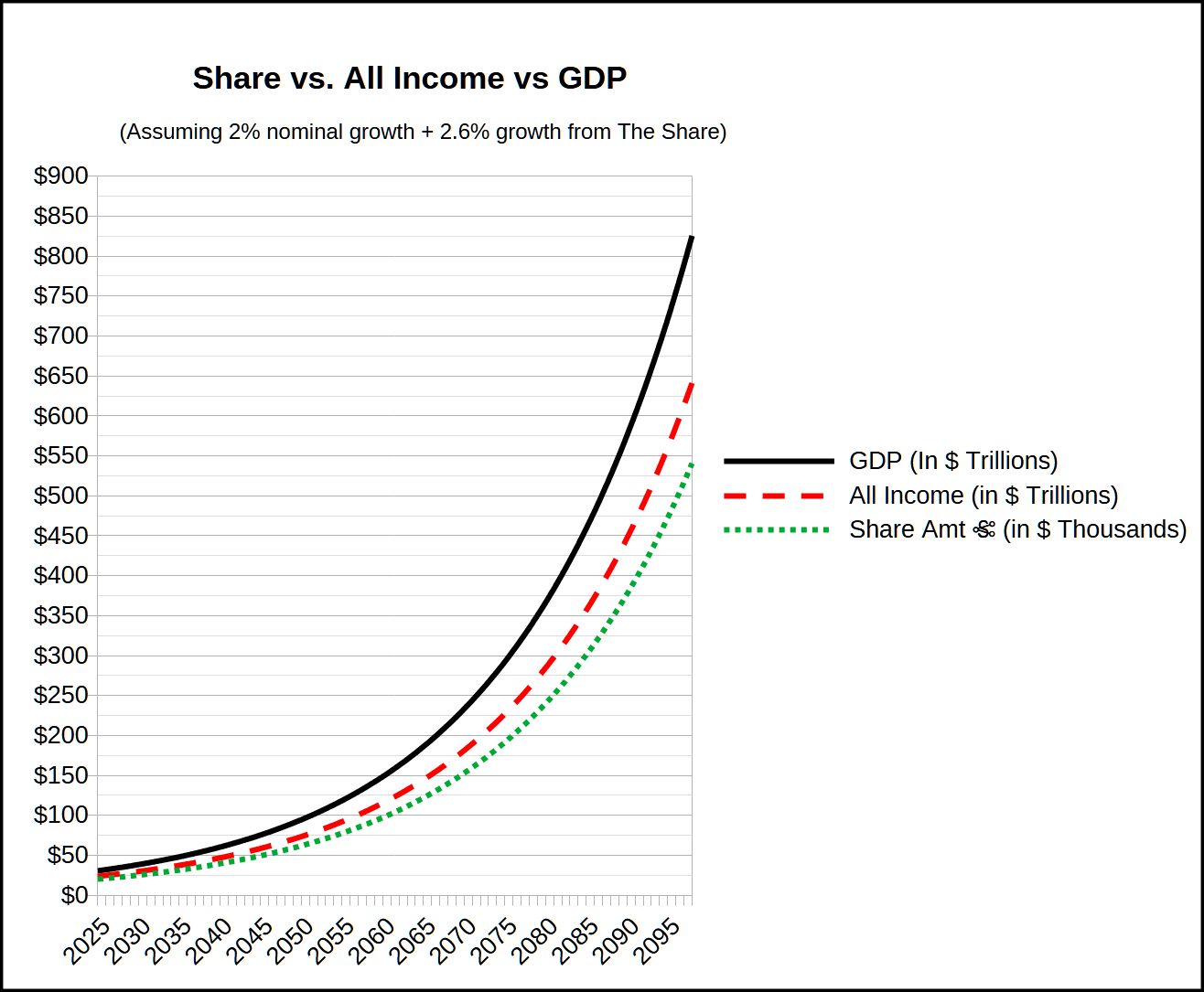
Figure 3. The Share Amount Growth vs All Income and GDP
4) Economic analysis
The Roosevelt Institute has done a comprehensive modeling of a UBI very similar to this one. Their results are used in the projections above.
Their page can be found here.
Their report can be downloaded here.
The relevant final results are on page 12, column 12: GDP increase of 2.62% and price level increase (inflation) of 0.56%.
Note that these numbers are in addition to baseline so we have modeled GDP as 2.62% plus a 2% baseline growth.
Inflation likewise would be whatever the background rate would be plus the 0.56%.
1. See the result of analysis on the "BEA_Table_1_12_1975-2024" tab of the Tax Rate calculation spreadsheet.
|
|
All documents formatted and/or identified as Legislation are hereby donated to the public domain. |